We were given an assignment in our THEDES2 class (Theory of Design 2) to observe and look for postmodern architecture buildings in manila, and critique how these buildings formed the city. While I was looking for postmodern buildings in Manila, I’ve observed that most of the buildings are in art nouveau and neo-classical style. While in Makati, almost all the buildings are in international and brutalism style. But in Taguig, particularly Fort Bonifacio Global City, I’ve noticed that most of the buildings are built in postmodern and international style.
Postmodern architecture came about because of modernity’s too formal and rigid style. The style is informal and playful. It rejects all modernism’s formalism and rawness in design. I can say that this style of architecture is about freedom of ones expression in art and as it is translated in architecture, it becomes more unique.
The structures of postmodernism architecture in the Philippines are mainly commercial buildings, malls, and condominiums. Postmodern architecture is always very striking that’s why I think it becomes a big asset for commercial businesses to use this style in their structures. On the other hand, Filipinos are very conservative when it comes to family that’s why Postmodern architecture is not well used in designing homes.
Fort Bonifacio Global City is a well urbanized rising city of Metro Manila. It is located near Makati and is said to be an extension of Makati City. It is a beautiful and well-planned city. And in a few years now, I can say that it can be compared to Singapore or Hong Kong’s successful cities. The city is filled with condominiums, malls and commercial buildings. And they all fit accordingly. Everything is in context with each other. The buildings are differently designed but blended beautifully with all other buildings. The city is clean and well organized.
Fort Bonifacio High Street is I think one of the most prominent postmodern building in The Fort. Actually, it looked like a group of smaller buildings connected as one. Every shop had their freedom to design their own building according to their own theme. I think that is an idea of a postmodern style; a mixture of different styles and still blending perfectly together. The rail walks and park also made a huge impact to building, making it an interactive place for children and adults. The spaces creates different feeling and the volumes varied from shop to shop. Just across the street is the Serendra which is very much like Bonfacio High Street but more elegant and wit. This place is really nice and it has different spaces that makes the place unique and interesting. The shops and residences are built with different colors and textures. It also reminded me of piazzas that can be seen in Italy because of the fountains and spaces where people can walk.
Another building that I find extraordinarily postmodern is the Starbucks at the Fort. Starbucks, as we all know, has its own theme applied to its architecture. But not this one. The two-story structure is uniquely built using indigenous and modern materials. What makes this building postmodern is basically its materials and how it was used. It reminded me of the “bahay na bato” because of the windows and balcony and also the stairs. The exterior is profoundly suggesting a brutalism inspired design but inside it exhibits Philippine indigenous materials like capiz, bamboo and narra. Inside you could feel the warmth and at the same time the feeling of being at home. Even the tables and chairs has a touch of Philippine materials. It also exhibits paintings of Filipino people. The air ducts, although contrasting with indigenous materials, gives a style of a postmodern architecture. This Starbucks also has a drive thru having also a design of Philippine’s bahay na bato. The capiz window-like was used with the use of steel.
BGC at the Fort, like Fort Bonifacio High Street, is a combination of different bars and restaurants. It also gave each restaurant the freedom of designing their own structure. Gourdo’s Cafe and shop is really a great example of a postmodern structure. The facade, where the cafe is has playful colors, shapes and volumes. The combination of different planes and volumes perfectly made it postmodern in style. The varying volumes of pots made it more lively. The main door also gives an effect of a tall door because of its continuity and similarity to the high windows. On the other side, where you enter the shop, the facade has different colors and volumes. The interior of the structure is almost modern but what makes it different is the use of blind arcade as shelves and door. I think what postmodern implies in architecture is that it is not wrong to ruin the axis, that colors can be differently paired with other colors, that volumes can rather be different from one another, and we can mix everything together as long as they blend in with the use and user of the building. Another postmodern structure there is the Ristorante Italiano L’Opera. This structure is renaissance architecture inspired. This is completely postmodern design because it brought back the renaissance style with the use of modern materials and other modern features like glass, colors and roof. Next is the Amber Ultra Lounge which is basically a black box covered with gold abstract shape on the entrance. What makes this building postmodern in design is the inequality and contrasting colors, yet it evokes something more. It makes you want to go inside and it gets your attention intentionally. Another building is the Craft Pub Grill. Again, the building is classical in design but uses modern characteristics like in material and colors. The use of color red in the entrance is contrasting against the pale background, but then, it makes the building unique and grandeur. The Scarlet Wine Lounge and Katsu Japanese Grill is two different restaurants but blended well with one another. The Scarlet’s varying lines coexisted in the Katsu Japanese Grill. The Katsu features a well ordered lines contrasting to Scarlet’s chaotic lines. But these two structures was well combined with each other.
Another example of a postmodern structure in the fort is the mini cooper shop or simply mini. Mini is well known for mini cooper cars. And the building itself looks like mini because of the huge text of “mini” in the facade. Another prominent element in the building is a mini cooper car placed on the wall. Postmodern design can be seen with the use of elements and colors in the mini cooper building. The interior has also display of mini cooper roofs and logo.
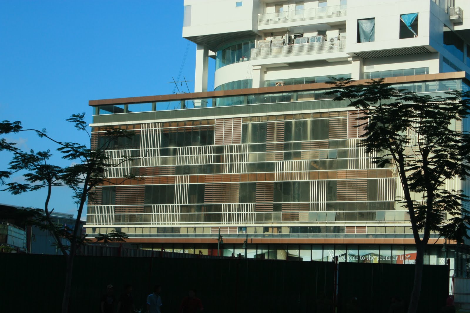
The 32nd and fifth is another postmodern building at the Fort. It contains different planes and volumes. But inside it is very skeletal. The form is I think postmodern because of its different texture and materials. It also has different colors but again, blending well with glass. The other building beside it is the HSBC which also is a postmodern in style. With the use of its red theme, the building also made us of red lines to emphasize the building and the being of its name.
Another postmodern building is the St. Luke’s Medical Center. The building is postmodern because of the its different volumes. On the entrance, you would find marble balls that creates more dramatic entrance. And the ramp on the right side is somewhat maze-like. It has playful elements outside and inside. Breaking the axis also made this building different because it creates more beautiful and useful spaces. The hospital didn’t really looked like an hospital which I guess made this building very successful.
The f1 City Center is also a great example of a postmodern building. It has different volumes. The largest volume is the tower and down below, is the vast foundation where the tower lies. It has varying design of rectangular shapes and lines. The color is also differently applied. It has also different texture and materials. But overall, the building looks unique and playful.
Postmodern Architecture in the Philippines is becoming more successful because the people who use this type of architecture creates a marketing strategy to promote what they are selling and what they want the consumers to feel. Postmodern can really be good in economy but not always. Postmodern has also its downfall. Postmodern can really be too playful and representation. However, this type of architecture is very well adapted by Filipinos. Filipinos are very much capable of adapting. They adapt quickly but not entirely. Postmodernism is all about freedom. Freedom in terms of volumes, colors and materials. And altogether becomes more useful and active buildings. And Filipinos fought for their freedom. The way we build postmodern is also like being free. Because we break rules; rules that inappropriate, rules that makes our building boring and the same from any other buildings. Also, postmodern is like living at ease. That we should not think of what people think of us but to think of what we should do in order for us to live.


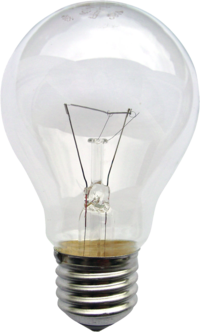

 We were asked to design a treehouse for our design class. I felt really excited about it, because I really dreamt of having my own treehouse when I was young. My concept for my treehouse is a light bulb. I chose this to be the concept because light symbolizes life as well as the tree symbolizes life. Light also is a manifestation of enlightenment and ideas. My working concepts are illuminance, shine, bright, noticeable, round and bloated. When I translated it in my design, I thought of using materials like glass, steel and probably wood. I also thought that it shouldn't be so closed like an actual light bulb but again, glass would be used for protection against rain. I think that it should be very open so you could feel the tree and nature. I also thought that I should use a spiral staircase to represent the bulb light's insulation or sleeve. When a person enter my treehouse, I want them to feel in touch with the tree. Because that is its main use; to live and feel the connection between a home and a tree. Moreover, I want my treehouse to stand out. Because light signifies focus and attention. I would use the shape of a bulb which is round so that it could shelter the tree because trees are basically round. The floor plan would be circular and it would be encircling the tree as well. It would be an open floor plan so that the tree could breathe and the air could enter the house. It would have a second floor which I could turn into a room. But it will just be a loft since I am limiting my tree house with walls. There would also be a bathroom and kitchen. So the space I've provided will be a living space where you could feel at home and free from all the noise of the city.


